B2B E-Commerce Case Study:
How Tree Testing Improved Baileigh’s Product Findability by 85%
Sales reps were overwhelmed by calls from site visitors unable to find small-ticket products online. IA research helped the company overhaul its site structure and increase self-service, web sales, and sales team productivity.

Challenge: Users Struggling to Find Products
Years ago, we began working with Baileigh Industrial, a leading maker of industrial metalworking and woodworking machinery. One of the first things we did was conduct 1:1 interviews with Baileigh’s sales reps. A major pain point among the reps was website visitors calling to ask about small-ticket products, which limited the amount of time they could spend talking to big-ticket product shoppers.
We heard this same frustration when we spoke to Baleigh’s senior management, and the same desire: to improve self-service on the website for small-ticket customers, freeing up sales reps to focus on people who truly needed their expertise.
As we started conducting usability testing, we realized a key barrier to self-service: customers often struggled to find the product, or even the product category, that they wanted. They repeatedly wasted time going down the wrong paths using the site’s navigation.
Jakob Nielsen tells companies that “deficiencies in your IA [information architecture] are costing you a lot of money, right now”, and our research suggested this was happening for Baileigh.

Approach: Tree Testing & Card Sort Studies
A year later, Baileigh was undergoing a full website redesign. If we were going to make IA changes, now was the right time to do it. But first, we needed a baseline measure of the current IA’s performance. And we needed to know if the IA required small tweaks, a complete overhaul, or something in between. Tree testing was our IA research tool of choice.
Tree testing is the fastest, most effective way to assess, and pinpoint problems with, a site’s information architecture. We ask representative users to find products or information using a simple, clickable “tree” of the site’s navigation; and we record each click.
The method works well for any type of site, application, or software: product-focused, information-focused, marketing-focused, or task-focused.
The resulting data shows which products, content, and tasks are easy for customers to find or initiate, and where they struggle. We also learn which category structures and labels are likely to cause confusion, abandonment, and lost sales.
Designing the Study
Here’s the approach we used for this study:
- We focused on Baileigh’s metalworking products, which was the most visited section of the site.
- We recruited 64 users for the test. We found most of them through an ad in the company’s email newsletter. A smaller number came via the company’s social media pages.
- In a post-test questionnaire, 32% of participants classified themselves as metalworking experts, 55% as intermediate, and 13% as beginners — which matched the mix we were seeking. About 50% had purchased Baileigh products.
- We used the Treejack platform from Optimal Workshop to run the test.
- The test consisted of 8 possible tasks, each one focusing on a different top-selling product category. An example: You need to precisely bend some quarter-inch sheet metal into a V shape on a vertical plane. Where would you look?
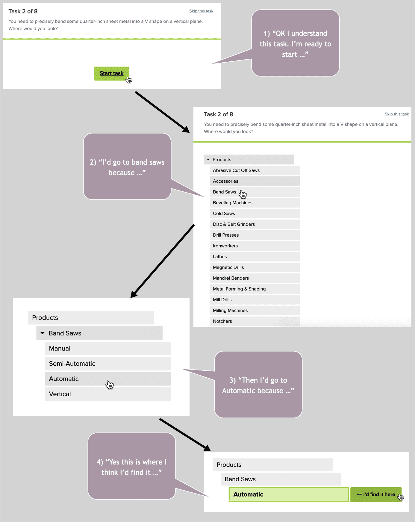
A demonstration of a tree testing scenario and how a qualitative research participant might think aloud during the task.
A big challenge with tree testing is capturing an accurate picture of how users navigate the site in the real world. If you’re not careful with the study design, you give away the answers and fail to learn anything useful. With this in mind, we avoided using navigation link names, like “mandrel bender”, in the tasks — since this would artificially lead users to the correct links.
Non-leading tasks are particularly difficult to pull off with a highly specialized set of products or content like the company’s, where synonyms are hard to come by. We went back-and-forth multiple times with our SME at the company to ensure the right task wording.
We also limited each user to 5 randomly assigned tasks — since after 5 tasks many people have “learned” the navigation in ways they wouldn’t in the real world.
Analyzing the Data
After you run users through a study, the Treejack software scores your tasks on various findability-related metrics. The simplest is the Overall Score, a 1 to 10 measure for each task that combines your Success and Directness scores, with 10 being the best score. Success is the percentage of participants who successfully select the right answer. Directness is the percentage of participants who did not backtrack at all when selecting an answer. The Overall Score favors Success over Directness at a ratio of 3:1.
To do the analysis, we started by drilling into each task, focusing on tasks where users struggled. Here’s the task we demonstrated above, which scored a disappointing 3 out of 10 on Overall Score.
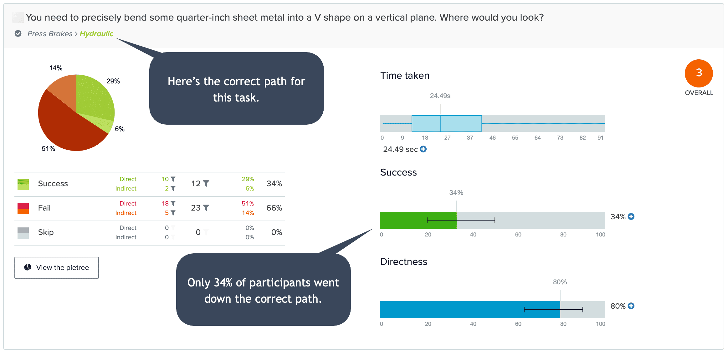
Analysis of the task demonstrated earlier.
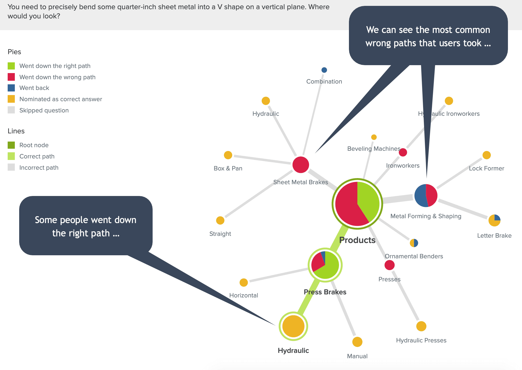
On tasks where many users took the wrong path, we wanted to know the most common wrong paths. Pietrees allowed us to visualize the click data and spot navigation patterns.
After completing the task-level analysis, we took a step back and looked for themes across our findings that could inform holistic improvements.
Here were our biggest takeaways:
- Overall performance was poor, with an Overall Score of 4.0 out of 10 across the 8 tasks.
- There were too many top-level product category choices, leading many users down the wrong path from the start.
- Some navigation hierarchies overlapped and were not intuitive to users.
- Similar or misleading subcategory names caused many users to pick the wrong targets.
Research-Driven Changes
If the IA had performed well overall, we would have focused on iterative improvements like category label changes. But the data told us we needed to make fundamental changes to the site’s organization.
So we turned to our favorite IA research method to help rethink a site’s structure and generate a new IA: a card sort study.
We conducted this study with 20 representative users of the company’s site. The data allowed us to 1) understand how customers naturally group metalworking products in their minds, and 2) identify more intuitive category and subcategory names.
We then designed a new information architecture that:
- Broadened categories so that users have an easier first choice and are not funneled away from their target by a single wrong click.
- Reevaluated and reworded problematic subcategory names to prevent confusion.
- Included context for tools’ function where possible.
We followed this with a second tree test. To get an accurate before-and-after picture, we reused the original tasks (with minor wording tweaks to account for new navigation labels) and recruited a fresh group of about 60 participants.
Result: Easier-to-Find Products
Users found the right product category more often and more quickly with the new IA.
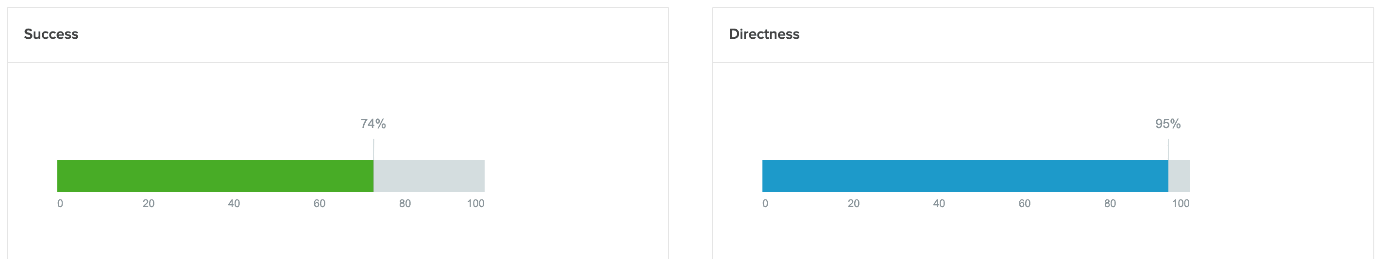
In tree test #1 with the original IA, Treejack gave us an Overall Score of 4.0 out of 10 across 8 tasks. In tree test #2 with the revised IA, Treejack gave us an Overall Score of 7.4 out of 10 across those same 8 tasks. This represents an 85% improvement in product findability.
The original IA failed to score above a 5 out of 10 on any of the 8 tasks. The revised IA scored a 7, 8 or 9 out of 10 on 6 of 8 tasks.
Since launching the new site, the company’s web revenue and leads are up by large margins. While it’s not possible to isolate the architecture’s contribution to this growth, follow-up analysis suggests a significant ROI from our human-centered overhaul of the company’s IA.
More Case Studies
Improving a Smithsonian Website’s Findability with Tree Testing
The findability of digital content is critical at the world’s largest museum, education, and research complex. Early in the redesign process of the Smithsonian Global website, we led IA research that pointed the way toward a more intuitive navigation.
Tree Testing for Vacation.com Settles a Navigation Debate
Project team members disagreed on the best category labels for a new website’s navigation. Qualitative and quantitative tree testing quickly settled the debate and helped to improve content findability.