Healthcare App Case Study:
Helping Mount Sinai Improve Cancer Patient Health Through Usability Testing
With a launch date looming, a team uses rapid UX testing to improve a web-based health app for oral cancer survivors and caregivers.
Photo by National Cancer Institute on Unsplash
Challenge: Complex App for Cancer Survivors
The team at Mount Sinai’s Icahn School of Medicine in New York City was worried. Supported by a grant from NIH, they’d been working for months on a new web app. Their goals were to:
- Improve oral health and rehabilitation in oral cancer survivors; and
- Improve the coordination of care between survivors and their family caregivers.
They’d written pages and pages of tutorial content, and built out numerous modules that users could walk through step by step. As the team tried out the app in a test environment, everything worked and made sense to them.
Still, two months away from their target launch date, they were left wondering: How would the experience be for their target audience? Would users engage with the tool, return to it, and share it with others? Or would they abandon quickly out of frustration or confusion or boredom?
The stakes were high. About 50,000 Americans are diagnosed with oral cancer each year, including many smokers and tobacco users. Of those, only 60% will be alive 5 years later.
The period after oral cancer treatment is critical and challenging. Eating, drinking, tasting and breathing can all pose difficulties for survivors and their caregivers.
The Mount Sinai team had observed these problems first-hand with their own patients and wanted to develop a web-based application to help oral cancer patients across the U.S. during this post-treatment period. Because they had a deep understanding of the audience and their problems, they were confident they could develop a useful, effective portal. Yet they knew how difficult it is to educate the public about complex medical topics and to motivate people to change behaviors in a stressful time.
They also knew that, while they were experts on the subject matter, they lacked expertise in digital user experience design. Even if the content resonated with users, would the flows and interactions make sense to them? And would users be able to find the content they needed most?
The Mount Sinai team reached out to Marketade to conduct a usability research study and provide UX recommendations that would increase the app’s chances for success. With their looming launch date, they needed the research-backed recommendations within a month.
Approach: Rapid Usability Testing
Within a few weeks, Marketade completed a remote usability study with 16 participants — 10 cancer survivors and 6 caregivers — and provided human-centered design recommendations to the Mount Sinai team.
Here were the key steps in our process:
- Interviewed the Mount Sinai team about goals, scope, etc.
- Wrote draft test plan and shared with Mount Sinai for feedback
- Launched recruiting of oral cancer survivors and caregivers
- Piloted test script with 2 participants; made rapid revisions to tasks
- Ran study with remaining 14 participants
- Analyzed sessions and identified problems
- Documented and prioritized findings; explored and sketched solutions
- Shared findings, recommendations and sketches with Mount Sinai
Through qualitative user testing sessions along with heuristic analysis, Marketade identified 33 usability problems with the app. We categorized each finding by app section or topic to make it easier for the dev team to tackle in batches. For instance, we spotted 4 problems with the login/registration process, 6 problems with navigation, and 5 problems with links.
One of our biggest findings was “Site doesn’t say who is behind it, hurting credibility.” In reality, the site was backed by some of the world’s top oral cancer experts and one of the world’s most reputable hospitals. But none of this was visible to users. And just as the Stanford Guidelines for Web Credibility Guidelines would have predicted (see guideline #2), this content gap caused skepticism among our usability participants.
Other examples of problems we identified:
- Medical jargon, unclear language, and too much fluff
- Buttons and some links are same color as body content
- Progression of lessons is not clear
- Visited links don’t change color
For about half of the problems, we shared video clips from our usability testing to help designers, writers and developers understand the issue and empathize with users. This is never as good as true team-based research, but it’s better than just sharing the written findings, and was our best option for this project. There was plenty of positive feedback about the site from users, and we mixed that into our clips.
Result: “Such Valuable Feedback”
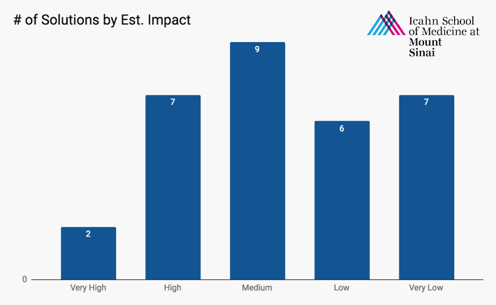
We recommended a rough solution or UX guideline for nearly every problem we identified. These were not detailed requirements or designs, since the Mount Sinai team was in a better position to come up with those. Our goal was to guide them (e.g. “use plain language”) or provide an example to stimulate solution thinking. Where possible, we provided screenshots to show both the problems and potential solutions.
Based on our research and experience with similar tools, we estimated the impact of each solution on a scale of 1 to 5 to help the team prioritize their work.
Despite the large number of problems identified, the Mount Sinai team was energized by the study and the improvement opportunities. After we shared the results, the project lead wrote us to say:
“We really love the videos and report. It is such valuable feedback and we look forward to going through everything and making the suggested changes to make the site better! The testers certainly gave us a lot to think about!”
— Project Lead at Mount Sinai
About the Project
- Industry: Healthcare; education
- Platform: Web Application
- Audience type: Consumers (patients)
- Specific audiences: Oral cancer survivors and caregivers
- Methods: Usability testing
- Sample size: 16 participants
- Length: 1 month
- Stakeholders: Product team
- Organization size: 6,200 employees
More Case Studies
Usability Testing with Older Adults for a New AARP Digital Platform
A team at AARP was eager to increase adoption and engagement for a new life management platform. Marketade combined usability testing and a heuristic evaluation to identify UX improvement opportunities.
How a Website Survey Gave UVA Health Actionable UX Insights
How do you launch a website survey that captures actionable data without annoying users? Here’s the step-by-step process we used for a regional health system along with the keys to our survey’s success.