
Helping Stanford Improve an Energy Platform’s UX & KPIs
Marketade partnered with a team at Stanford University to evaluate and improve an energy-saving app’s user experience, KPI measurement model, and A/B testing.
Last updated: June 30, 2026
Background
A team at Stanford University’s Doerr School of Sustainability had built an MVP of a platform that powered several energy-saving applications. Through a virtual ‘concierge’ that guided consumers to make energy upgrades in their homes, the solution’s goal was large population-wide energy savings in the U.S. The digital platform was developed by leaders in energy behavior change and was based on empirical learning across multiple fields and other Stanford initiatives.
Through funding from the U.S. Department of Energy, California Energy Commission (CEC), and iterative research with thousands of users, the team made significant progress in the design, development, and tracking of the platform.
Now the team was seeking help with expanding customer acquisition through iterative improvements to the platform’s UX and measurement of key performance indicators. They partnered with Marketade to provide strategic recommendations, initial implementation support, and team training.
Marketade used a 3-stage approach as follows:
Step #1: Analytics & KPIs
We facilitated a working session to review the platform’s key performance indicators (KPIs) and current measurement model. Based on a series of exercises, we recommended a revised KPI measurement model that identified and defined the KPIs and specified tracking sources for each one.
Next, we reviewed the platform’s Google Analytics conversion goal tracking and other metrics. Based on our review, we recommended tracking changes and new performance dashboards.
Step #2: User Experience
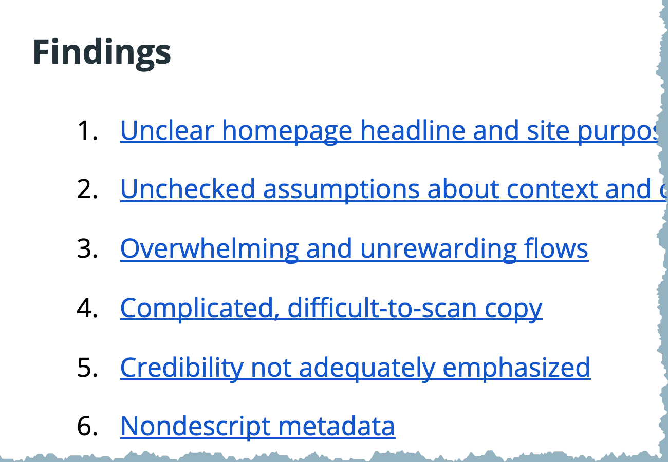
Our researchers conducted a heuristic review of the platform on desktop and mobile devices. We placed ourselves in the shoes of the target audience and completed core tasks as we evaluated the user interface against UX best practices.
Out of a large number of friction points, we prioritized the top UX problems that the team should focus on. For each finding, we spelled out the problem, shared the best practice or guideline, and proposed 2-4 specific solutions.
Several of our findings focused on content and copy problems. As a separate deliverable, we provided sample copy rewrites for 7 parts of the platform to help the team improve the content.
Step #3: Conversions & A/B Testing
The Stanford team was already conducting frequent A/B testing to improve its conversions. We reviewed their tests and provided feedback on their approach and ideas.
Drawing on the new measurement model and our heuristic review, we recommended 3 areas to focus on with future A/B testing. For each area, we pointed to the specific components to test, the related KPIs, and the specific measures of success.
* * *
For each of our deliverables throughout the project, we met with the Stanford team to discuss our recommendations and provide lightweight training.
At the end of the engagement, the Stanford team walked away with short-term and long-term ideas to improve the platform’s user experience and KPIs. They spent the next 6 weeks “implementing big changes to the platform” based on our findings and recommendations.
More Case Studies
Move Fast and Refine Things: How We Built a UX Research Program for a Leading Global Education Organization
To build a virtual UX lab from scratch within a global organization, our team hit the ground running, set up a system that fit our client, and refined our methods along the way.
Website Usability Testing with Patients for UVA Health
To improve its website experience for patients, we led mixed-methods usability research for this major regional health system with the #1 hospital in Virginia. After combining qualitative UX testing with 2 types of quantitative research, we led a 1-day analysis workshop.